
One of the services that Pima Association of Governments provides to local government members is access to information they need to evaluate, plan and execute urban infrastructure and environmental resilience policies.
PAG originally created and hosted an online tool to identify the surface temperature and tree canopy coverage throughout the Tucson metro area in 2010. Together, the data provides a mechanism to conduct a heat severity analysis as local governments in our region seek to initiate climate resilience strategies, or incorporate such strategies into land use and building codes or policies.
The Heat Impacts and Relief Map is found in the recently updated PAG Resiliency Planning Map sets. The interactive tool incorporates surface temperature information and a tree canopy coverage, among other data layers on an interactive, online mapping tool.
Planners are interested in heat because extreme heat has costs to human health, labor productivity, energy consumption, water use and ecosystem diversity.
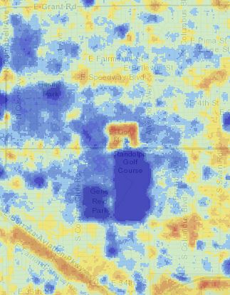
The surface temperature information is displayed through a heat index layer created using thermal satellite data from summer months in 2013, 2014 and 2015. The index is displayed with color patterns to show how an area compares to the overall metro area’s temperature average.
“The updated heat index shows how much higher or lower each area is compared to the average,” said Benjamin Hickson, PAG senior GIS analyst.
The map doesn’t show exact temperatures, because it aims to convey relative heat stress, rather than absolute, but it’s an easy-to-interpret, zero-to-10 scale. Areas that are about the same temperature as the metro area average are a five and are shown as a pastel green color. Those that are below average rank from zero to four in terms of how far they stray from average. They are shown in shades of blue. Areas with an average temperature above the overall average are shown in a range of yellow to red colors, ranked as six-to-10 on the index.
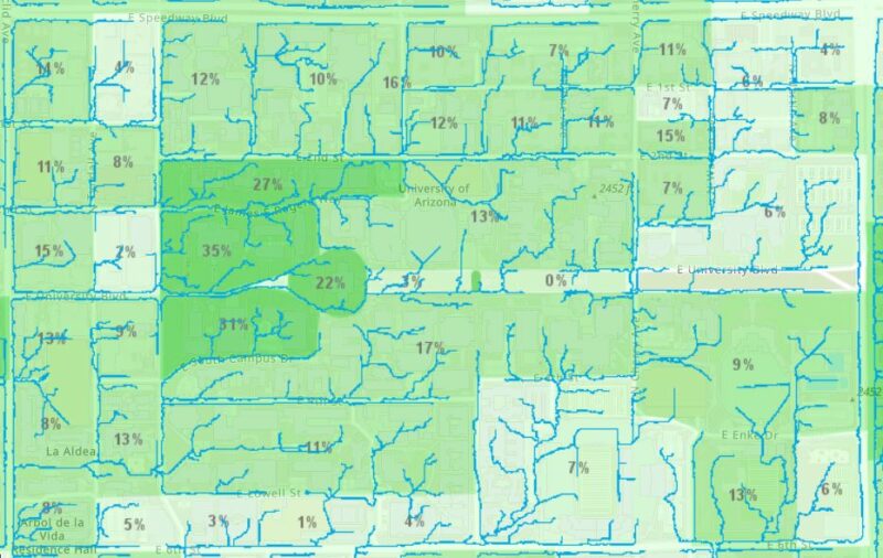
The tree canopy coverage map data layer can be displayed in two ways, either as a canopy map showing where individual canopy coverage exists, or as the percent of each census block covered by tree canopy without showing the landscaping location.
Those layers, coupled with other data, such as stormwater flow paths, cooling center locations, or a census CDC social vulnerability index, can help planners at the PAG member jurisdictions and other organizations extract information to inform plans, such as where to plant trees.
The online tool’s display of sortable information also could inform efforts to harvest stormwater runoff, improve zoning and land use codes and more. Those strategies can help government agencies in the metro area create and apply policies about landscaping, stormwater and water conservation management, architectural development and other comprehensive planning elements.
The PAG team credits a collaboration with Ladd Keith, Ph.D., for contributing to the revised methodology for the updated Heat Index data. Keith conducted National Science Foundation-funded research on the use of similar mapping and data work nationwide, as well as locally, years ago. He continues to advise PAG on tools and data for this type of heat resiliency planning. He has mentioned that PAG has the longest standing and most publicly accessible heat planning map that he has seen.
Keith’s expertise helped inform PAG’s update of the resilience mapping tools.
“We worked with the university to make sure that we were tracking to the right methodology and the right way to approach this, and it brought a great partnership and a lot of credibility to the work,” said Paul Casertano, PAG transportation planning director.
PAG has developed several additional partnerships for data sharing and feedback. PAG works with colleagues at the City of Tucson and the Pima County Regional Flood Control District, among others, to build on this planning work. The map provides baseline data for all users and is available for public use.
Next steps
Altogether, the data puts the Tucson region on the forefront of heat-related climate planning.
With the data offering context and information, planning can be more comprehensive and integrated.
The Resiliency Planning Tool is one example of how PAG is taking the initiative to combine data sources, and efforts continue to consider more data.
“The next thing we’re trying to work on with it is to provide additional information to assess trends. How does the data compare over time? Which areas are getting colder? Or, which are getting hotter?” Hickson said.